
No one gives a shit what you think on the topic frankly.The numbers are mathematically impossible because the Hamas run health registry has no capacity to accurately do a death toll at this point. Yes the numbers are wildly inaccurate. They aren't an overcount they are a massive undercount. It wouldn't surprise me if theres been a 6 figure death toll at this point.
You are using an out of date browser. It may not display this or other websites correctly.
You should upgrade or use an alternative browser.
You should upgrade or use an alternative browser.
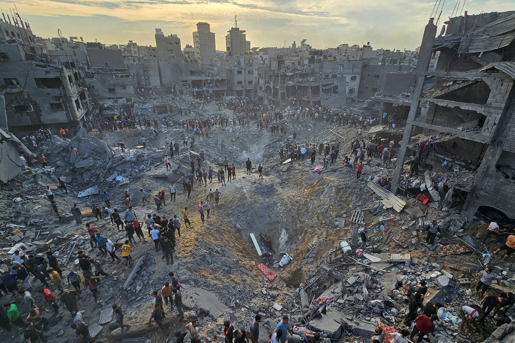
International Hamas launches surprise attack on Israel; Israel has declared a state of war. Vol. VII
- Thread starter Strychnine
- Start date
- Joined
- Feb 13, 2006
- Messages
- 7,689
- Reaction score
- 4,790
Has anyone done an analysis to 'disprove' Abraham Wyner's conclusions that Hamas released casualty figures were not 'natural numbers'? It has been 10 weeks since the article was published.
Would this not be the most rational way to approach this disagreement? Math doesn't care about political affiliations. Surely there's some liberal think tank that could have got a couple math PhDs to look into the data, his calculations, and if he was completely wrong in his math and conclusions?
Saying conservative Jewish mathematicians can't be impartial or do math related to Israel is quite antisemitic.
- Joined
- Nov 26, 2003
- Messages
- 10,181
- Reaction score
- 8,588
Has anyone done an analysis to 'disprove' Abraham Wyner's conclusions that Hamas released casualty figures were not 'natural numbers'? It has been 10 weeks since the article was published.
Would this not be the most rational way to approach this disagreement? Math doesn't care about political affiliations. Surely there's some liberal think tank that could have got a couple math PhDs to look into the data, his calculations, and if he was completely wrong in his math and conclusions?
Saying conservative Jewish mathematicians can't be impartial or do math related to Israel is quite antisemitic.
Yes there have been other statisticians that have debunked Wyner's results. I could PM you some if you want.
I'll engage with you because I think you'll be fair and can look at things somewhat objectively. Even though I know Wyner is a biased actor with an agenda, I'll pretend he's not.
The fundamental premise of Wyner's analysis is based on two things:
1. On the days with many women casualties, that should coincide with the days with a lot of child casualties. Because he's making the assumption most of the time children are with women. But his data set doesn't supposedly coincide with that according to him.
2. The amount of increasing deaths reported is "too linear." The line is too straight on the graph basically. He says “an extremely regular increase in casualties over the period” and from which he concludes that “this regularity is almost surely not real.” There would be much more variations in real life, especially a war zone. This is the MAIN crux of his argument.
So he concludes: THEY MUST BE LYING.
He gave this graph as the example of how this isn't a natural increase in deaths.

The fundamental problem with this graph is that he MANIPULATED the data to take into account cumulative deaths to make it look linear.
When you graph the INDIVIDUAL deaths day by day in the exact same time period, the graph looks like this. NOT LINEAR AT ALL.

1. He manipulated the graph to make it look like the numbers were linear when they weren't at all.
2. The data Wyner used was from October 26, 2023 until November 10, 2023. That’s 16 days. This conflict has been going on for almost 6 months.
You have to ask yourself: Why would a PhD economist even attempt to perform such a statistical analysis based on only 16 days?
3. These numbers are documented deaths. I.e., the body was brought to a hospital/medical facility, the cause of death was established, and the person was identified (which includes not only the name but also the ID number).
A record is considered incomplete if identity number, full name, date of birth, or date of death is missing. Only after all this info is gathered are these confirmed numbers reported.
Well almost all healthcare data is aggregated in set time periods— once a week, every 3 days, or month etc. it’s too difficult for healthcare facilities to report out daily given the nature of their work, staffing constraints, recording time, time it takes to transfer the data, etc. Health min likely receiving data once every x amount of days.
Basically, you can only count so fast. And in the middle of a war, it's hard to hire more bean counters sometimes. So even if there is some linear increase in deaths, that just indicated when the deaths were RECORDED and not when they actually died.
4. Historically — in conflicts in 2008, 2014, and 2021 — the health ministry’s fatality numbers closely matched death tolls resulting from independent research by United Nations humanitarian agencies.
5. There's no rule that women deaths have to coincide with child deaths 1:1. Children can range from 0-17 years of age. Why does a teenager have to be with a woman? That argument doesn't even make much sense.
So basically Wyner cherrypicked a tiny sample size and manipulated it to look linear when it wasn't. He's full of shit.
Last edited:
- Joined
- Jan 9, 2007
- Messages
- 2,685
- Reaction score
- 2,500
Why bother PM him and not post it here?Yes there have been other statisticians that have debunked Wyner's results. I could PM you some if you want.
I'll engage with you because I think you'll be fair and can look at things somewhat objectively. Even though I know Wyner is a biased actor with an agenda, I'll pretend he's not.
The fundamental premise of Wyner's analysis is based on two things:
1. On the days with many women casualties, that should coincide with the days with a lot of child casualties. Because he's making the assumption most of the time children are with women. But his data set doesn't supposedly coincide with that according to him.
2. The amount of increasing deaths reported is "too linear." The line is too straight on the graph basically. He says “an extremely regular increase in casualties over the period” and from which he concludes that “this regularity is almost surely not real.” There would be much more variations in real life, especially a war zone. This is the MAIN crux of his argument.
So he concludes: THEY MUST BE LYING.
He gave this graph as the example of how this isn't a natural increase in deaths.
The fundamental problem with this graph is that he MANIPULATED the data to take into account cumulative deaths to make it look linear.
When you graph the INDIVIDUAL deaths day by day in the exact same time period, the graph looks like this. NOT LINEAR AT ALL.
1. He manipulated the graph to make it look like the numbers were linear when they weren't at all.
2. The data Wyner used was from October 26, 2023 until November 10, 2023. That’s 16 days. This conflict has been going on for almost 6 months.
You have to ask yourself: Why would a PhD economist even attempt to perform such a statistical analysis based on only 16 days?
3. These numbers are documented deaths. I.e., the body was brought to a hospital/medical facility, the cause of death was established, and the person was identified (which includes not only the name but also the ID number).
A record is considered incomplete if identity number, full name, date of birth, or date of death is missing. Only after all this info is gathered are these confirmed numbers reported.
Well almost all healthcare data is aggregated in set time periods— once a week, every 3 days, or month etc. it’s too difficult for healthcare facilities to report out daily given the nature of their work, staffing constraints, recording time, time it takes to transfer the data, etc. Health min likely receiving data once every x amount of days.
Basically, you can only count so fast. And in the middle of a war, it's hard to hire more bean counters sometimes. So even if there is some linear increase in deaths, that just indicated when the deaths were RECORDED and not when they actually died.
4. Historically — in conflicts in 2008, 2014, and 2021 — the health ministry’s fatality numbers closely matched death tolls resulting from independent research by United Nations humanitarian agencies.
5. There's no rule that women deaths have to coincide with child deaths 1:1. Children can range from 0-17 years of age. Why does a teenager have to be with a woman? That argument doesn't even make much sense.
So basically Wyner is full of shit.
Demonstrate how Wyner altered his graph to appear linear.
Your non-linear graphic “smoking gun” relates to the daily death counts approximated at 270 +/- 15% which is described by Wyner in his piece. Even if the graph itself of the daily deaths is non linear, it still retains an approximate mean average rate of change which results in a linear slope - i.e. constant and non accelerating rate of change.
Here is another statistical analysis from the Washington Institute with a similar conclusion to Wyner from January.
How Hamas Manipulates Gaza Fatality Numbers: Examining the Male Undercount and Other Problems
International media and NGOs have repeated the group's figures without caveats, giving credence to suspicions of Israeli misconduct and fueling accusations of war crimes and even genocide.
Last edited:
- Joined
- Nov 26, 2003
- Messages
- 10,181
- Reaction score
- 8,588
Why bother PM him and not post it here?
Demonstrate how Wyner altered his graph to appear linear.
Your non-linear graphic “smoking gun” relates to the daily death counts approximated at 270 +/- 15% which is described by Wyner in his piece. Even if the graph itself of the daily deaths is non linear, it still retains an approximate mean average rate of change which results in a linear slope - i.e. constant and non accelerating rate of change.
Why do I need to demonstrate how he altered the graph when we have the ACTUAL raw number graph?
The sample size is only 16 days. There is literally no need to manipulate the numbers due to the sample size. Mean average and extrapolation based on a tiny sample size is useless.
Just look at the raw daily figures. Which obviously shows it's not linear.
Why is he only analyzing 16 days in the first place? We have months of data. That should be the first red flag.
Don't even know why I'm engaging with you when I know you're not going to be honest.
- Joined
- Jan 9, 2007
- Messages
- 2,685
- Reaction score
- 2,500
Why do I need to demonstrate how he altered the graph when we have the ACTUAL raw number graph?
The sample size is only 16 days. There is literally no need to manipulate the numbers due to the sample size. Mean average and extrapolation based on a tiny sample size is useless.
Just look at the raw daily figures. Which obviously shows it's not linear.
Why is he only analyzing 16 days in the first place? We have months of data. That should be the first red flag.
I don’t understand how you claim that he altered it to appear linear when given the daily delta of casualties- mapped on any graph, would give a linear slope.
Please post counter analysis here.
- Joined
- Nov 26, 2003
- Messages
- 10,181
- Reaction score
- 8,588
I don’t understand how you claim that he altered it to appear linear when given the daily delta of casualties- mapped on any graph, would give a linear slope.
Please post counter analysis here.
Are you blind? I posted the raw figures graph right underneath Wyner's graph. Those figures seem completely possible.
I do not believe you to be honest so answer my question first, then I'll acquiesce to any of your queries.
Why is he only analyzing 16 days when we have months of data?
- Joined
- Jan 9, 2007
- Messages
- 2,685
- Reaction score
- 2,500
Are you blind? I posted the raw figures graph right underneath Wyner's graph.
I do not believe you to be honest so answer my question first, then I'll acquiesce to any of your queries.
Why is he only analyzing 16 days when we have months of data?
You work in advertising, right? Are you on the creative team or numbers? Either way, I hope that you understand that linearity doesn’t refer to changes in exact repeating increments, but overall trends of behavior.
Please post said counter analysis.
- Joined
- Nov 26, 2003
- Messages
- 10,181
- Reaction score
- 8,588
You work in advertising, right? Are you on the creative team or numbers? Either way, I hope that you understand that linearity doesn’t refer to changes in exact repeating increments, but overall trends of behavior.
Please post said counter analysis.
That was just a bunch of word salad bullshit and not answering my question. Why is he only analyzing 16 days when we have months of data?
I'm not going to be your dancing monkey when you can't answer the most basic questions.
- Joined
- Jan 9, 2007
- Messages
- 2,685
- Reaction score
- 2,500
That was just a bunch of word salad bullshit and not answering my question. Why is he only analyzing 16 days when we have months of data?
I'm not going to be your dancing monkey when you can't answer the most basic questions.
I get it, you're part of creative.
- Joined
- Nov 26, 2003
- Messages
- 10,181
- Reaction score
- 8,588
I get it, you're part of creative.
Concession accepted.
- Joined
- Oct 13, 2008
- Messages
- 49,175
- Reaction score
- 31,834
So since the "ceasefire" talks, the only hostages IDF have found are three dead bodies of those slaughtered on 7th October and taken back to Gaza. I keep saying.....there are no hostages anymore. Hamas have NOTHING to bring to the table hence the ceasefire, heavily lopsided in their favour, collapsed.
There will be a couple more weeks of dead bodies then Rafah will be force-fed donkeyfood and Hamas will have its last stand.
There will be a couple more weeks of dead bodies then Rafah will be force-fed donkeyfood and Hamas will have its last stand.
- Joined
- Jan 9, 2007
- Messages
- 2,685
- Reaction score
- 2,500
Concession accepted.
I concede that you seem incapable of having a conversation about a statistical analysis and that you have failed to bring supporting evidence (which you claim to hold) to the table.
- Joined
- Nov 26, 2003
- Messages
- 10,181
- Reaction score
- 8,588
I concede that you seem incapable of having a conversation about a statistical analysis and that you have failed to bring supporting evidence (which you claim to hold) to the table.
^^^ Can't answer simple questions, but wants conversation on advanced statistical analysis to cover up that he's full of shit.
- Joined
- Jan 9, 2007
- Messages
- 2,685
- Reaction score
- 2,500
^^^ Can't answer simple questions, but wants conversation on advanced statistical analysis to cover up that he's full of shit.
lol, your dumbass tried taking this conversation into the weeds and now you got cold feet.
stick to drawing pictures, creative.
p.s. still waiting on the counter statistical analysis that you have in your possession. happy to help you read it if you want some help.
- Joined
- Nov 26, 2003
- Messages
- 10,181
- Reaction score
- 8,588
lol, your dumbass tried taking this conversation into the weeds and now you got cold feet.
stick to drawing pictures, creative.
^^^Self described physician that resorts to lame insults because he's losing a debate on a karate forum lol.
Answer question then I will proceed. Why is Wyner only analyzing 16 days when we have months of data?
- Joined
- Jan 9, 2007
- Messages
- 2,685
- Reaction score
- 2,500
^^^Self described physician that resorts to lame insults because he's losing a debate on a karate forum lol.
Answer question then I will proceed. Why is Wyner only analyzing 16 days when we have months of data?
Don't play high and mighty with me, it just adds to your lack of self awareness. Your posts are riddled with insults across the board.
If you think you're doing well here, it seems that you over identify with Hamas and their definition of "winning".
You want to claim that Wyner selected this data set because it was easier to falsify an analysis to promote an ideological bias.
To be clear, this is your personal attribution that you are projecting onto a Jewish statistician without providing a concrete statistical analysis to support this claim.
To prove this, you would need to provide other similar analyses which demonstrate that this data set is an exception and defies patterns of reporting from other months.
You claim to have this information, but are refusing to post it.
Last edited:
- Joined
- Nov 30, 2005
- Messages
- 15,400
- Reaction score
- 14,609
That was just a bunch of word salad bullshit and not answering my question. Why is he only analyzing 16 days when we have months of data?
I'm not going to be your dancing monkey when you can't answer the most basic questions.
Find a new cop-out catch phrase, dude.
That's a whole lot of word salad saying nothing.
Yea where's the proof. That's just people claiming stuff as they bomb buildings. All the health care facilities bombed - where's the proof they were using human shields in those cases.
No proof then. Just word salad bullshit as usual.
You're not addressing what I said. How is the money going to the UNIVERSITY endowments "funding the protests"?
Bunch of word salad bullshit you just posted because you realize your initial point doesn't make any sense at all.
WTF are you talking about. I'm supposed to understand this cryptic word salad with no context?
"Remember that time you totally straw
manned me because you attributed a less common use definition to a word that I used which made zero fucking sense in the context of what I was writing!?"
These are all quotes from the same thread, i.e., the one we're in right now.
- Joined
- Jan 23, 2006
- Messages
- 11,698
- Reaction score
- 13,203

Hamas war splits Israel's cabinet as defense minister balks at running Gaza
Defense Minister Yoav Gallant, backed by two centrist members of the cabinet, said Israel's army will not control Gaza after the war.
 www.usatoday.com
Hamas war splits Israel's cabinet as defense minister balks at running Gaza
JERUSALEM − Israeli government splits over the war in Gaza broke open this week after the defense minister demanded a clear strategy from Prime Minister Benjamin Netanyahu as troops returned to battle Hamas fighters in areas the army had fought in months ago.
The comments from Defense Minister Yoav Gallant, who said he would not agree to setting up a military government in the Palestinian enclave, reflect growing unease in the security establishment at the lack of direction from Netanyahu over who will be left to run Gaza when the fighting stops.
They also brought out the sharp split between the two centrist former army generals in the cabinet, Benny Gantz and Gadi Eisenkot, who both backed Gallant's call, and the hard right nationalist religious parties led by Finance Minister Bezalel Smotrich and Internal Security Minister Itamar Ben-Gvir, who condemned the comments.
However, backed by Ben-Gvir and Smotrich, both close to the West Bank settler movement, Netanyahu has rejected any role in running postwar Gaza by the Palestinian Authority, set up under the Oslo interim peace accords three decades ago and generally seen internationally as the most legitimate Palestinian governing body.
- Joined
- Nov 30, 2005
- Messages
- 15,400
- Reaction score
- 14,609
Yes there have been other statisticians that have debunked Wyner's results. I could PM you some if you want.
I'll engage with you because I think you'll be fair and can look at things somewhat objectively. Even though I know Wyner is a biased actor with an agenda, I'll pretend he's not.
The fundamental premise of Wyner's analysis is based on two things:
1. On the days with many women casualties, that should coincide with the days with a lot of child casualties. Because he's making the assumption most of the time children are with women. But his data set doesn't supposedly coincide with that according to him.
2. The amount of increasing deaths reported is "too linear." The line is too straight on the graph basically. He says “an extremely regular increase in casualties over the period” and from which he concludes that “this regularity is almost surely not real.” There would be much more variations in real life, especially a war zone. This is the MAIN crux of his argument.
So he concludes: THEY MUST BE LYING.
He gave this graph as the example of how this isn't a natural increase in deaths.
Now I don't want to toot my own horn here as I majored in computer engineering and took courses in Ordinary Differential Equations and Discrete Mathematics, but goddamn is that an unnaturally looking linear graph for war casualties if I've ever seen one.
Last edited:
Similar threads
- Locked
- Replies
- 3K
- Views
- 101K
- Locked
- Replies
- 4K
- Views
- 104K