
- Joined
- May 20, 2016
- Messages
- 34,432
- Reaction score
- 15,874
This originally started as a post in another thread, but I ended up wasting way too much time on it - as I'm sure some of you will remind me. But I really think that attempting to graph political ideology, as pedantic, frustrating, and contradictory as it may often be, is kind of fascinating and can lead to some interesting debate. This is especially true with this style of chart, which gets circulated a lot, where apparently dissimilar persons/ideologies are forced into being closely proximal (see Hugo Chavez and Dwight Eisenhower).
This is what I came up with.
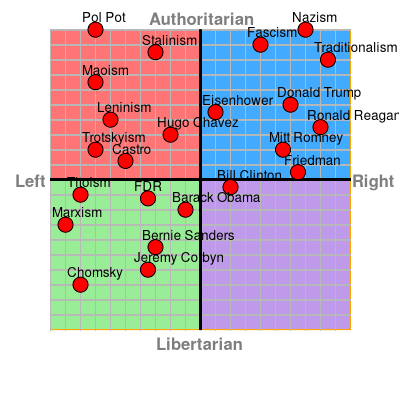
I wish I could amend some placements -- moving Obama a bit to the right, Leninism and Stalinism a bit to the right, Fascism a smidge to the left -- but sadly it's etched in digital stone.
So make your own, give it a go, make some comment about how my graph sucks.
I'll tag the same people that I was going to tag in my post, for additional thoughts: @Jack V Savage @TheGreatA @PolishHeadlock @Rod1
This is what I came up with.
I wish I could amend some placements -- moving Obama a bit to the right, Leninism and Stalinism a bit to the right, Fascism a smidge to the left -- but sadly it's etched in digital stone.
So make your own, give it a go, make some comment about how my graph sucks.
I'll tag the same people that I was going to tag in my post, for additional thoughts: @Jack V Savage @TheGreatA @PolishHeadlock @Rod1
Last edited: