• Xenforo Cloud has scheduled an upgrade to XenForo version 2.2.16. This will take place on or shortly after the following date and time: Jul 05, 2024 at 05:00 PM (PT) There shouldn't be any downtime, as it's just a maintenance release. More info here

Economy US Inflation hits a 12 month low of 6.5%

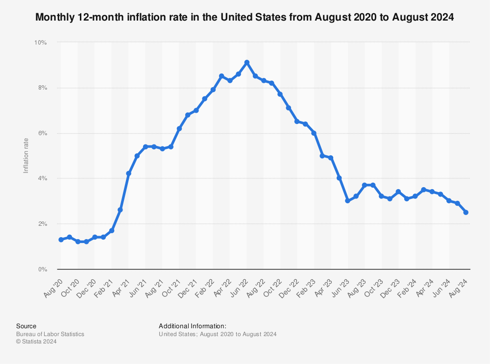
Anyone else find it funny that you can immediately tell the story the person making the graph is trying to tell about inflation by the scale of the visual representation? That one on the far right is like, 1/5 as tall as the big one in the middle - inflation must be super, super low! It's less than half the height of the month before - what a massive decrease!
Starting the graph at already ludicrously high and comparing Biden last month to more Biden's high inflation a year ago is a lot more fun than using a 0-10 scale and extending before he was president.

unadjusted-monthly-inflation-rate-in-the-us.jpg
 
Starting the graph at already ludicrously high and comparing Biden last month to more Biden's high inflation a year ago is a lot more fun than using a 0-10 scale and extending before he was president.

unadjusted-monthly-inflation-rate-in-the-us.jpg

See, even a guy hackish/dumb enough to type the phrase "Biden's inflation" (lol) can't help but show the turnaround, even using a graph that cuts off in November. :) If anything, it shows the turnaround even more starkly than the graph the other hack was whining about (and would show it still more starkly if it were up to date).
 
Anyone else find it funny that you can immediately tell the story the person making the graph is trying to tell about inflation by the scale of the visual representation? That one on the far right is like, 1/5 as tall as the big one in the middle - inflation must be super, super low! It's less than half the height of the month before - what a massive decrease!
{<redford}
 
Anyone else find it funny that you can immediately tell the story the person making the graph is trying to tell about inflation by the scale of the visual representation? That one on the far right is like, 1/5 as tall as the big one in the middle - inflation must be super, super low! It's less than half the height of the month before - what a massive decrease!

That is pretty funny. Starting from 6 haha. But I'm happy it's going down. Can't spend less than 100.00 unless you buy 2 things

The numbers are a good indicator to be honest, but yea that is old school though lol, depending on the goal, you're actually trained to create visuals that way for storytelling. Hell I even do it all the time with charts I create or need created for me at work. I sent graphs back to Sr. Asso. pretty much like "bro this doesn't look good, think about it and resend by tomorrow morning" lolol. That's how it is. Need to see Advisory performance improving when using shared internal systems vs outdated 90s style work? Start the chart at a preferred axis. Need to show that underperformance wasn't as bad as expected? Start at $0 when showing a 12 month trend chart that reaches $32M with $5M per point lol. There's an infinite amount of ways to present data when needing to share numbers to an audience, but it's probably the best part of anyone with a statistics-related job. My favorite at least. The power of charts and graphs starts at the first visual before you've digested the story within the data itself.

Good catch, but yea the number is still a good indicator.
 
It's the same thing with Obama's economic 'recovery'. There's only one way to go when you hit rock bottom. The question is why it was there in the first place and the rate at which things move away from it.

And the Biden administration did little to lower inflation rates, this is solely due to the fed hiking interest rates and oil becoming cheaper. In fact he probably affected inflation by demonizing oil companies.
 
Starting the graph at already ludicrously high and comparing Biden last month to more Biden's high inflation a year ago is a lot more fun than using a 0-10 scale and extending before he was president.

unadjusted-monthly-inflation-rate-in-the-us.jpg

Lol bro that's significantly worse though, as you're posting a chart ending in November, when it would be implied you're intentionally leaving out the post-dated months. You'd get fired for this haha.
 
The numbers are a good indicator to be honest, but yea that is old school though lol, depending on the goal, you're actually trained to create visuals that way for storytelling. Hell I even do it all the time with charts I create or need created for me at work. I sent graphs back to Sr. Asso. pretty much like "bro this doesn't look good, think about it and resend by tomorrow morning" lolol. That's how it is. Need to see Advisory performance improving when using shared internal systems vs outdated 90s style work? Start the chart at a preferred axis. Need to show that underperformance wasn't as bad as expected? Start at $0 when showing a 12 month trend chart that reaches $32M with $5M per point lol. There's an infinite amount of ways to present data when needing to share numbers to an audience, but it's probably the best part of anyone with a statistics-related job. My favorite at least. The power of charts and graphs starts at the first visual before you've digested the story within the data itself.

Good catch, but yea the number is still a good indicator.
Lol yup. You know the drill. My first PI in science would have me adjust the graphs many times to make the delta look better. Statistical significance is what it is but aestitics matter. But yeah I'm glad it's going down. Couldn't take much more of this.
 
The numbers are a good indicator to be honest, but yea that is old school though lol, depending on the goal, you're actually trained to create visuals that way for storytelling. Hell I even do it all the time with charts I create or need created for me at work. I sent graphs back to Sr. Asso. pretty much like "bro this doesn't look good, think about it and resend by tomorrow morning" lolol. That's how it is. Need to see Advisory performance improving when using shared internal systems vs outdated 90s style work? Start the chart at a preferred axis. Need to show that underperformance wasn't as bad as expected? Start at $0 when showing a 12 month trend chart that reaches $32M with $5M per point lol. There's an infinite amount of ways to present data when needing to share numbers to an audience, but it's probably the best part of anyone with a statistics-related job. My favorite at least. The power of charts and graphs starts at the first visual before you've digested the story within the data itself.

Good catch, but yea the number is still a good indicator.
My PI would also have me make the charts more narrow to have it look better haha. You are right there are many ways. Funny someone else has been there. Cheers
 
Lol yup. You know the drill. My first PI in science would have me adjust the graphs many times to make the delta look better. Statistical significance is what it is but aestitics matter. But yeah I'm glad it's going down. Couldn't take much more of this.

Definitely agree. It's 6 straight months of a drop in inflation, with likely more decline to come if things stay the course so I'm pretty optimistic. At least that we won't be tanking. For all the heat Smoking Joe Biden (from me half the time lol) gets I'd be the first to say things could be going in a very different direction right now but it's not. He should probably get more credit here considering he took all the heat when we were at 9% and hasn't received much accolade for his movements in bringing it down.

My PI would also have me make the charts more narrow to have it look better haha. You are right there are many ways. Funny someone else has been there. Cheers

Haha I'm literally adjusting a chart right now in PBI I received while typing this because our impact looks too low visually even though we've made better Q2 margins compared to last year hahaha. This is the way of the world.
 
It's the same thing with Obama's economic 'recovery'. There's only one way to go when you hit rock bottom. The question is why it was there in the first place and the rate at which things move away from it.

And the Biden administration did little to lower inflation rates, this is solely due to the fed hiking interest rates and oil becoming cheaper. In fact he probably affected inflation by demonizing oil companies.

Inflation is generally not affected by presidents in either direction. Same with economic growth. And "demonizing oil companies" has no impact at all on inflation. I think that partisanship really fucks with people's ability to understand the world.

I think one could plausibly tie the short-term boost in inflation to the relief package, and you could also tie the explosive economic growth in 2021 to that. In both cases, the effect has washed out and we're back to normal. That gets into the point where policy actually does matter--the gov't can help when there's an emergency (the ARRA also drove the strong recovery for America relative to other countries that didn't do as well there).
 
Definitely agree. It's 6 straight months of a drop in inflation, with likely more decline to come if things stay the course so I'm pretty optimistic. At least that we won't be tanking. For all the heat Smoking Joe Biden (from me half the time lol) gets I'd be the first to say things could be going in a very different direction right now but it's not. He should probably get more credit here considering he took all the heat when we were at 9% and hasn't received much accolade for his movements in bringing it down.


Haha I'm literally adjusting a chart right now in PBI I received while typing this because our impact looks too low visually even though we've made better Q2 margins compared to last year hahaha. This is the way of the world.
Lol good work! Promotion incoming haha. Yeah these guys live and die by the advisors they choose. Hopefully it keeps going.
 
Recently re-read Orwell's piece on James Burnham, which sort of gets into the thinking error that was driving expectations of permanently or at least persistently high inflation:

https://www.orwellfoundation.com/th...other-works/second-thoughts-on-james-burnham/

But curiously enough, when one examines the predictions which Burnham has based on his general theory, one finds that in so far as they are verifiable, they have been falsified. Numbers of people have pointed this out already. However, it is worth following up Burnham’s predictions in detail because they form a sort of pattern which is related to contemporary events, and which reveals, I believe, a very important weakness in present-day political thought.

...

Power worship blurs political judgement because it leads, almost unavoidably, to the belief that present trends will continue. Whoever is winning at the moment will always seem to be invincible. If the Japanese have conquered south Asia, then they will keep south Asia for ever, if the Germans have captured Tobruk, they will infallibly capture Cairo; if the Russians are in Berlin, it will not be long before they are in London: and so on. This habit of mind leads also to the belief that things will happen more quickly, completely, and catastrophically than they ever do in practice. The rise and fall of empires, the disappearance of cultures and religions, are expected to happen with earthquake suddenness, and processes which have barely started are talked about as though they were already at an end. Burnham’s writings are full of apocalyptic visions. Nations, governments, classes and social systems are constantly described as expanding, contracting, decaying, dissolving, toppling, crashing, crumbling, crystallizing, and, in general, behaving in an unstable and melodramatic way. The slowness of historical change, the fact that any epoch always contains a great deal of the last epoch, is never sufficiently allowed for. Such a manner of thinking is bound to lead to mistaken prophecies, because, even when it gauges the direction of events rightly, it will miscalculate their tempo. Within the space of five years Burnham foretold the domination of Russia by Germany and of Germany by Russia. In each case he was obeying the same instinct: the instinct to bow down before the conqueror of the moment, to accept the existing trend as irreversible.
It applies to Burnham in 1946 and to people who thought a brief jump in inflation would be permanent last year.
 
Well every time I bring up Trump's economic numbers I am met by legions of lib zombie hoardes claiming that it was Obama's policies that caused it, because the preceding president always gets credit for the current presidents results
.

Way to go Trump
 
Inflation is generally not affected by presidents in either direction. Same with economic growth. And "demonizing oil companies" has no impact at all on inflation. I think that partisanship really fucks with people's ability to understand the world.

I think one could plausibly tie the short-term boost in inflation to the relief package, and you could also tie the explosive economic growth in 2021 to that. In both cases, the effect has washed out and we're back to normal. That gets into the point where policy actually does matter--the gov't can help when there's an emergency (the ARRA also drove the strong recovery for America relative to other countries that didn't do as well there).
https://www.reuters.com/business/en...use-stop-criticizing-oil-industry-2022-06-21/
https://www.nbcnews.com/politics/wh...-biden-looks-shift-blame-gas-prices-rcna34895

The oil companies saying that Biden's rhetoric towards oil is causing them to slow down production, investment and the re-opening (post-COVID) of existing oil facilities. It's common sense as well, if the presidency says they want to move on from fossil fuels to renewable energies, especially with all the climate change doomsaying, why would any reasonable company invest into fossil fuels in the future? Especially when Biden (and other democrats) pledged to put a ban to ICE vehicles by 2035 (https://www.reuters.com/world/us/bi...federal-vehicle-purchases-by-2035-2021-12-08/).

Also, stop throwing words like 'partisan' to try to discredit any argument, it makes you look just that.
 
Lol bro that's significantly worse though, as you're posting a chart ending in November, when it would be implied you're intentionally leaving out the post-dated months. You'd get fired for this haha.
[<diva2]

What are the "post dated months"? The data they realease is for the previous month, so there's only 1 month not reflected on the chart because that was just released a few hours ago.

And of course you'd be fired for providing context. You get a promotion if you try to deceive people by starting the graph at 6 or you're off on job numbers by 10,000%.
 
Last edited:
This just means prices aren't going up quite as quickly. They are STILL going up. We are not seeing deflation.
 
Back
Top