• Xenforo Cloud upgraded our forum to XenForo version 2.3.4. This update has created styling issues to our current templates, this is just a temporary look. We will continue to work on clearing up these issues for the next few days and restore the site to its more familiar look, but please report any other issues you may experience so we can look into. Thanks for your patience and understanding.

UFC 279 promo poster makes Diaz look awkward & ridiculous

I thought Tre Telligman was the only fighter missing a pec..
 
This Diaz is a victim narrative is just pathetic.

It also doesn't look like the Poster.
 
How can a 2008 account post something so stupid?

It's gotta be a clever troll job
 
UFC's marketing dept. has great flexibilty of quality. Just ask Giblert or Anderson Aldo.

https%3A%2F%2Ffansided.com%2Ffiles%2F2015%2F06%2FScreen-Shot-2015-06-30-at-3.31.11-PM.png

CIw4K31WcAAc3GW.0.0.jpg
shirt.jpg
 
He probably just had to take a major dump.
 
He willfully posed like that and chose that posture for his promotional photos.
 
The UFC has never used an image of Diaz like this before.
I couldn't believe my eyes when they promoted it like this last night during the event.

FYYdhEcUsAI_TJn.jpeg


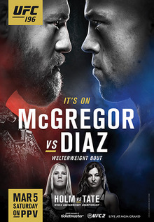
Just to give you an example of how they promoted him on other cards before.

UFC_244_Poster.jpg

Dos_Anjos_vs_McGregor.jpg
Haha you're actually right this isn't really flattering.
 
I mean, TS has a point here. Khamzat takes up most of the background space, even though there is plenty of open space to his left, so Nate is crowded on the right (as we see it). Also, Khamzat is overlapping Nate on top, when again, there is plenty of room to have both of them on the page without overlapping. Also, the image they used of Nate is bad. This is totally on purpose.
 
Isn't that how Nate always looks, pushing his shoulders forward trying to look all hard?
 
Back
Top