- Joined
- Jun 4, 2008
- Messages
- 61,813
- Reaction score
- 49,478
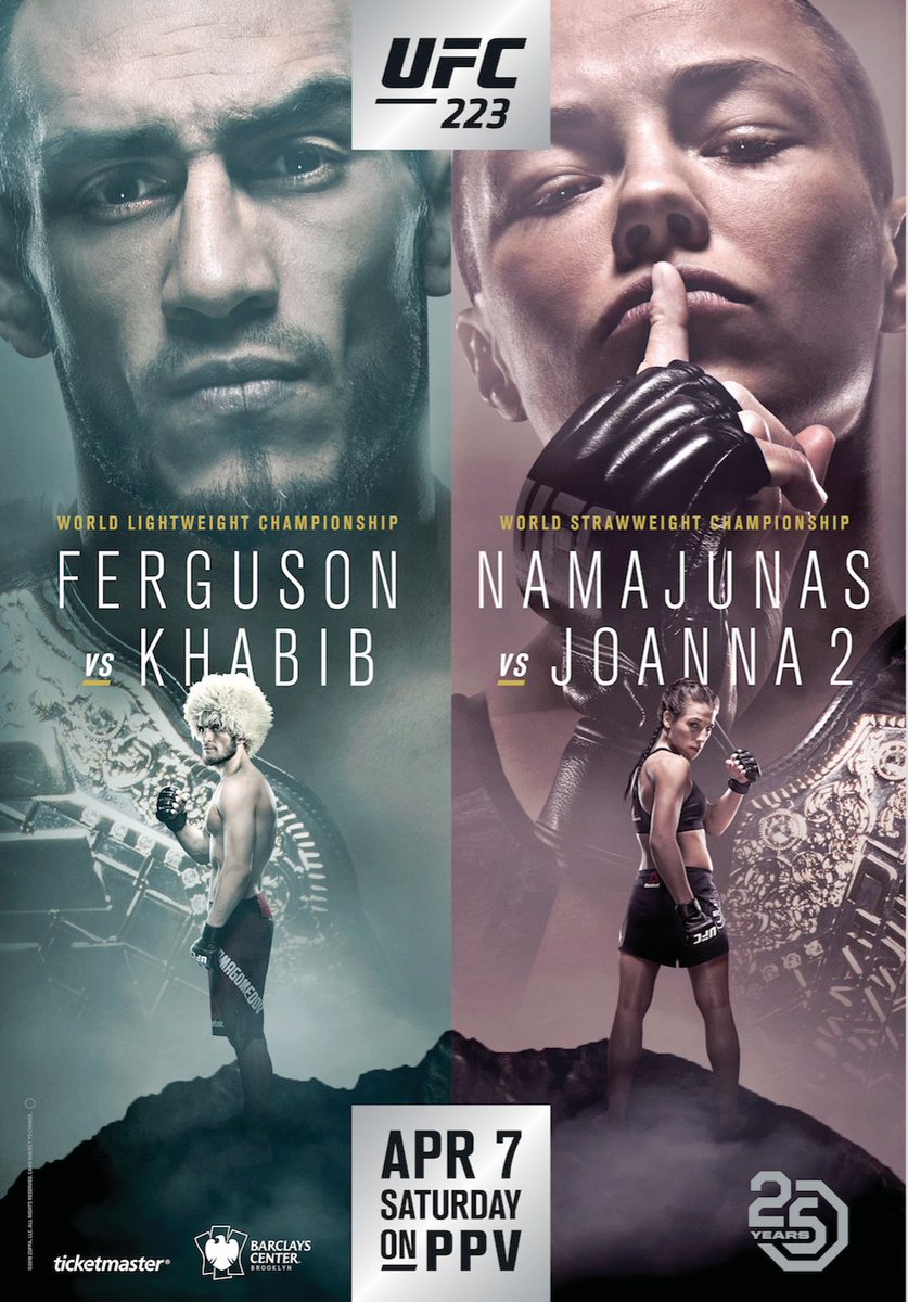
WTF why did they cut out Tony's receding hairline? . it makes me feel good about myself, but now I can't see it. Feeling disappointed.
Same here. I'm a fan but idk if I like what WME has her doing here or notThe Rose 'shush' pose is a either awesome or lame. I'm undecided.
Compared to this

It's damn good, even in it's own right, it's a nice breath of fresh air.
I think official UFC posters are geared towards advertising rather than art/creativity. That’s what folks like Bosslogic are for I guess.This poster is god-tier compared to some of the stuff thats been put out in the past few years, which is pretty sad.
I still don't understand WHY they have Bosslogic on their payroll to create designs for their fighter's shirts..yet don't have him working on the posters.
TERRIBLE!
WTF kind of pose is Joanna doing? My anaconda don't?
And there is no distinction that the right side is WMMA for the casuals. Or is that kind of the point? What a piss poor job. Sherdoggers can do better.
I demand to know why khabib isn’t riding a giant eagle!