
You are using an out of date browser. It may not display this or other websites correctly.
You should upgrade or use an alternative browser.
You should upgrade or use an alternative browser.
Why can't UFC produce great posters like this
- Thread starter ExitLUPin
- Start date
- Joined
- Jun 27, 2010
- Messages
- 8,344
- Reaction score
- 5,370

needs more birds
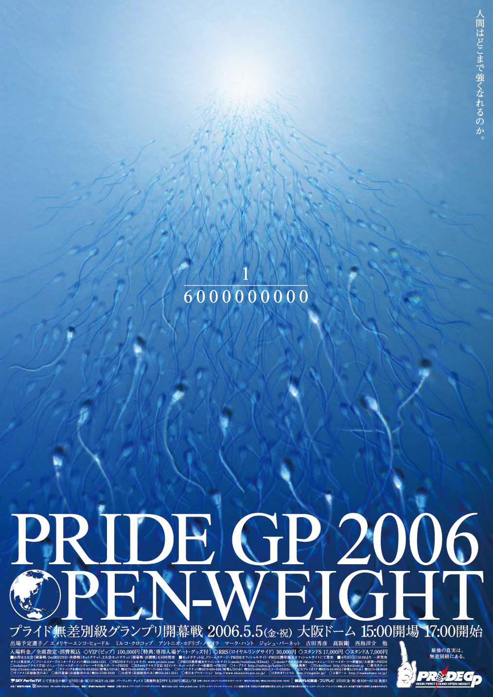
Gotta say not a fan of the color filter the UFC loves (gold). It's just dumb and fucks with design (i.e. Silva's shorts are bright yellow and blend in). Like the gold lighting just makes the poster look like there was really shitty lighting during the photoshoot. It's kind of an uncanny value thing of the poster is neither super realistic but also not super stylized. It's just bleh.Nice, the Pride ones really were fucking amazing, wonder what the person/people who designed them is doing now
194 is a bit like 262 in it's seperate bottom bit

/cdn.vox-cdn.com/uploads/chorus_asset/file/22456915/EzW9RR_VgAg3RhM.jpeg)
- Joined
- Aug 19, 2012
- Messages
- 8,049
- Reaction score
- 6,147
I like it, also thanks for posting this. I had no idea this fight was happening. Very interested in watching it.
Thoughts?
- Joined
- Feb 12, 2004
- Messages
- 143,515
- Reaction score
- 102,397
They are dealing with a fanbase that is going to shit on the poster no matter how good it is,so why bother?Because they don't want to waste the money?
- Joined
- Feb 12, 2004
- Messages
- 143,515
- Reaction score
- 102,397
Yeah most americans are gonna go "what the fuck is this SHIT"They look like they're teaming up together to fight bad guys.
Contribution:
Always liked this one

Then there's that sperm one!
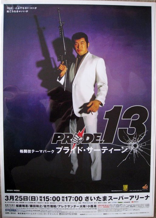
And don't forget!
UFC is making posters for their audience...who dont really give a shit about posters.
There will always be haters, but I think that's a bit extreme. For example, I think the fanbase responds much better to higher budget promos as opposed to the UFC's generic ones. I remember people loved the in depth one for Jones DC II, etc.They are dealing with a fanbase that is going to shit on the poster no matter how good it is,so why bother?
- Joined
- Feb 12, 2004
- Messages
- 143,515
- Reaction score
- 102,397
Not every fight is as important as those.There will always be haters, but I think that's a bit extreme. For example, I think the fanbase responds much better to higher budget promos as opposed to the UFC's generic ones. I remember people loved the in depth one for Jones DC II, etc.
- Joined
- May 10, 2018
- Messages
- 23,883
- Reaction score
- 34,058
Yeah I'm not into the piss stained look at all myself, despite the Silva one being my favourite in a long time.Gotta say not a fan of the color filter the UFC loves (gold). It's just dumb and fucks with design (i.e. Silva's shorts are bright yellow and blend in). Like the gold lighting just makes the poster look like there was really shitty lighting during the photoshoot. It's kind of an uncanny value thing of the poster is neither super realistic but also not super stylized. It's just bleh.
Sure. But it's not even so much spending more money as just spending it better. For reference, advertising and marketing are 10 percent of the UFC's revenue, it's kept fixed there usually. So it's not a massive line item. As an example of something cool and cheap, the UFC production for Korean Zombie and Yair, since it was a anniversary, the old school title cards were a sweet touch. Even though obviously the World Fucker logo isn't going to cut it in 2021 lol.Not every fight is as important as those.
I imagine the reasoning was "oh, championship belts are gold, let's tint everything gold." I guess if the UFC has ever had theme colors, it's black and gold.Yeah I'm not into the piss stained look at all myself, despite the Silva one being my favourite in a long time.
- Joined
- May 10, 2018
- Messages
- 23,883
- Reaction score
- 34,058
Yeah I made a piss stained version of 261 for a thread yesterday for a laugh.I imagine the reasoning was "oh, championship belts are gold, let's tint everything gold." I guess if the UFC has ever had theme colors, it's black and gold.

:no_upscale()/cdn.vox-cdn.com/uploads/chorus_asset/file/22410463/ExvzEAjU8AEWOCT.jpeg)
I would totally believe that was an official UFC posterYeah I made a piss stained version of 261 for a thread yesterday for a laugh. View attachment 848992
- Joined
- Jan 23, 2021
- Messages
- 453
- Reaction score
- 754

- Joined
- May 10, 2018
- Messages
- 23,883
- Reaction score
- 34,058
I mean it is, just I made it yellow haha.I would totally believe that was an official UFC poster
- Joined
- Jul 6, 2014
- Messages
- 10,804
- Reaction score
- 5,172
It's good but not great.
The problem with the UFC ones is that they became to standard. All of them have the same feel.
They should try something different at times like Pride did. Some of them were pure nonsense (but it's ok because japanese are crazy) but some were pretty impressive.
The problem with the UFC ones is that they became to standard. All of them have the same feel.
They should try something different at times like Pride did. Some of them were pure nonsense (but it's ok because japanese are crazy) but some were pretty impressive.
- Joined
- Sep 30, 2014
- Messages
- 9,042
- Reaction score
- 16,123
Looks like a movie cover
This, viacom gonna viacom
- Joined
- Apr 27, 2006
- Messages
- 30,392
- Reaction score
- 9,956
The UFC made an effort more than a decade ago to move their image towards legitimate sports and away from pro-wrestling, over the top entertainment. It was probably a good idea back then, but a side effect has been their complete contempt for good production design.
- Joined
- Aug 1, 2010
- Messages
- 3,116
- Reaction score
- 2,243
needs more birds
- Joined
- Sep 3, 2011
- Messages
- 1,004
- Reaction score
- 633
Strikeforce was the only MMA promotion that I can think of that had decent posters...
If you compare UFC posters to boxing posters from the 80s, they look like some graphic design shit a high schooler would make.
With all the money WME has can't they hire a decent graphics team? It's not that hard to do, especially in this day and age.
If you compare UFC posters to boxing posters from the 80s, they look like some graphic design shit a high schooler would make.
With all the money WME has can't they hire a decent graphics team? It's not that hard to do, especially in this day and age.
Similar threads
- Replies
- 149
- Views
- 6K