
You are using an out of date browser. It may not display this or other websites correctly.
You should upgrade or use an alternative browser.
You should upgrade or use an alternative browser.
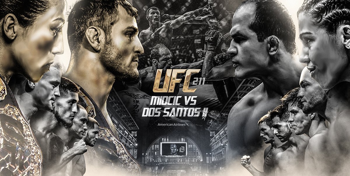
UFC 211 Official Poster
- Thread starter Vulcan
- Start date
- Joined
- Sep 18, 2016
- Messages
- 2,212
- Reaction score
- 0
Joanna easier to spell than that last name and also fits in the right amount of space
- Joined
- Jan 1, 2014
- Messages
- 7,107
- Reaction score
- 1,317
Also most of it would have been behind Stipe's neck.Joanna easier to spell than that last name and also fits in the right amount of space
- Joined
- May 15, 2013
- Messages
- 646
- Reaction score
- 0
i have like 6months practice on adobe photoshop and i make better posters than this. wtf
- Joined
- Nov 2, 2015
- Messages
- 4,434
- Reaction score
- 1,776
Dana should be tarred and feathered
These posters can look so much better
These posters can look so much better
J
JollyRants
Guest
UFC needs to hire who ever made this. Im sure they would take cheaper money than the UFC is paying who ever to make that shit up there.Dana should be tarred and feathered
These posters can look so much better
Last edited by a moderator:


- Joined
- Aug 13, 2013
- Messages
- 25,280
- Reaction score
- 4,093
They should check the IGs of @ToughPrints @ZLKV @ptrdesigns.... and do it right.
It's a nice idea that was rushed, clearly.
It's a nice idea that was rushed, clearly.
- Joined
- Nov 15, 2016
- Messages
- 3,098
- Reaction score
- 0
Stipe and Bisping could pass as brothers. If Bisping used Stipe's passport, I don't think a developing country immigration officer will be able to tell the difference.
- Joined
- Jul 7, 2013
- Messages
- 10,306
- Reaction score
- 146
Fuck it. I like it.
- Joined
- Jun 30, 2015
- Messages
- 339
- Reaction score
- 137
Only Joanna is looking decent on this poster.. JDS was shot too dark, and in a position you normally see amateur kickbox leagues promote their cards. Stipe looks like he had enough lame instructions from the photographer and they just forgot to put Jessica's face on there?! WTF Wme! This is one of the worst posters there have ever been. If it only had more birds though...
- Joined
- Jul 16, 2015
- Messages
- 3,118
- Reaction score
- 1
Dana should be tarred and feathered
These posters can look so much better
A poster of any event shouldn't be that size, it should be more long than width
Last edited:
Latest posts
-

-
 Social Tennessee lawmakers pass bill to allow teachers to be armed
- Latest: Copper Burner
-
